
This section allows administrators to configure the visual appearance and branding of the mobile application. This includes uploading logos, setting the splash screen, and defining the app’s color scheme.
To configure, follow these steps:
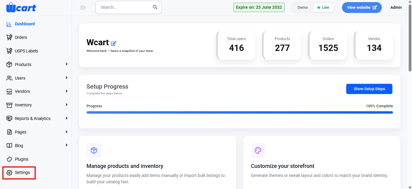
- Navigate to the sidebar menu and select ‘Settings’.
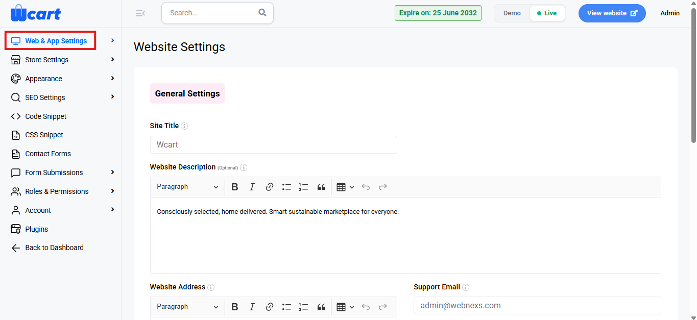
- Select ‘Web & App Settings’.
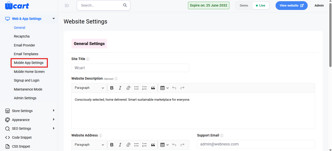
- Then, select ‘Mobile App Settings’ from the submenu.
General Settings
App Logos & Splash Screen
Administrators can upload the following assets to customize the mobile app’s branding:
- App White Logo: Upload the logo to be displayed on light backgrounds.
- App Dark Logo: Upload the logo to be displayed on dark backgrounds.
- Splash Screen: Upload the image that appears while the mobile application is loading.
Click ‘Choose File’ to select and upload the respective image files.
Color Configuration
This section allows administrators to define the color scheme used across the mobile application.
- Global Color: Sets the overall theme color applied throughout the app.
- Base Color: Defines the foundational UI color used for primary layouts and elements.
- Primary Color: Used for primary buttons, highlights, and key UI components.
- Secondary Color: Used for secondary buttons and supporting UI elements.
- Info Color: Applied to informational messages and indicators.
- Alert Color: Used for error messages and critical alerts.
- Success Color: Applied to success messages and confirmation indicators.
- Warning Color: Used for warning messages and caution indicators.
Each color can be selected using the color picker or by entering a hex color code.
Save Settings
After configuring the logos and colors, click the ‘Submit’ button to save and apply the changes to the mobile application. A toast notification ‘Mobile APP Settings Updated Successfully’ will appear to confirm the update.
These settings help ensure consistent branding and an improved visual experience across the mobile application.