
This section allows you to customize the colors of various elements on your website or app, aligning with your brand or preferences. The settings are categorized, each controlling a different part of the user interface.
To configure, follow these steps:
- Navigate to the sidebar menu, click ‘Settings’.
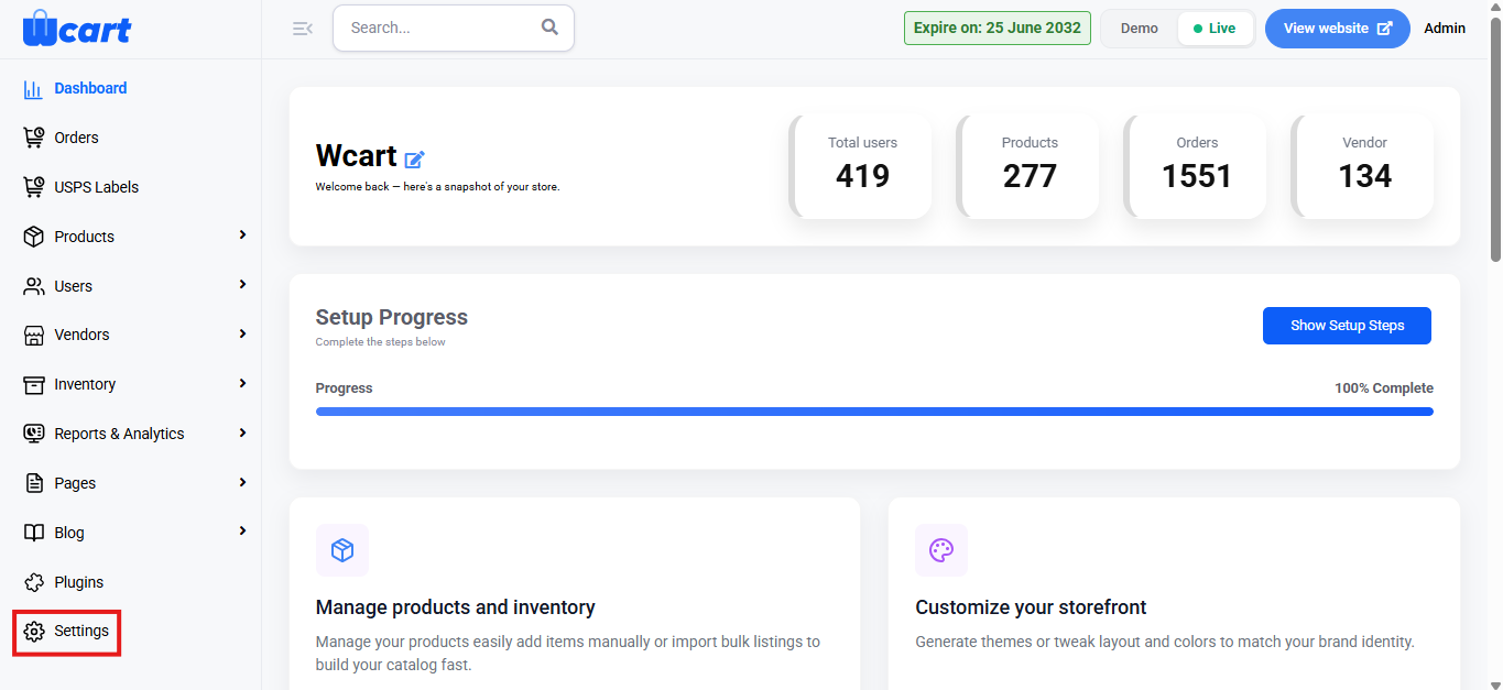
- Select ‘Appearance’.
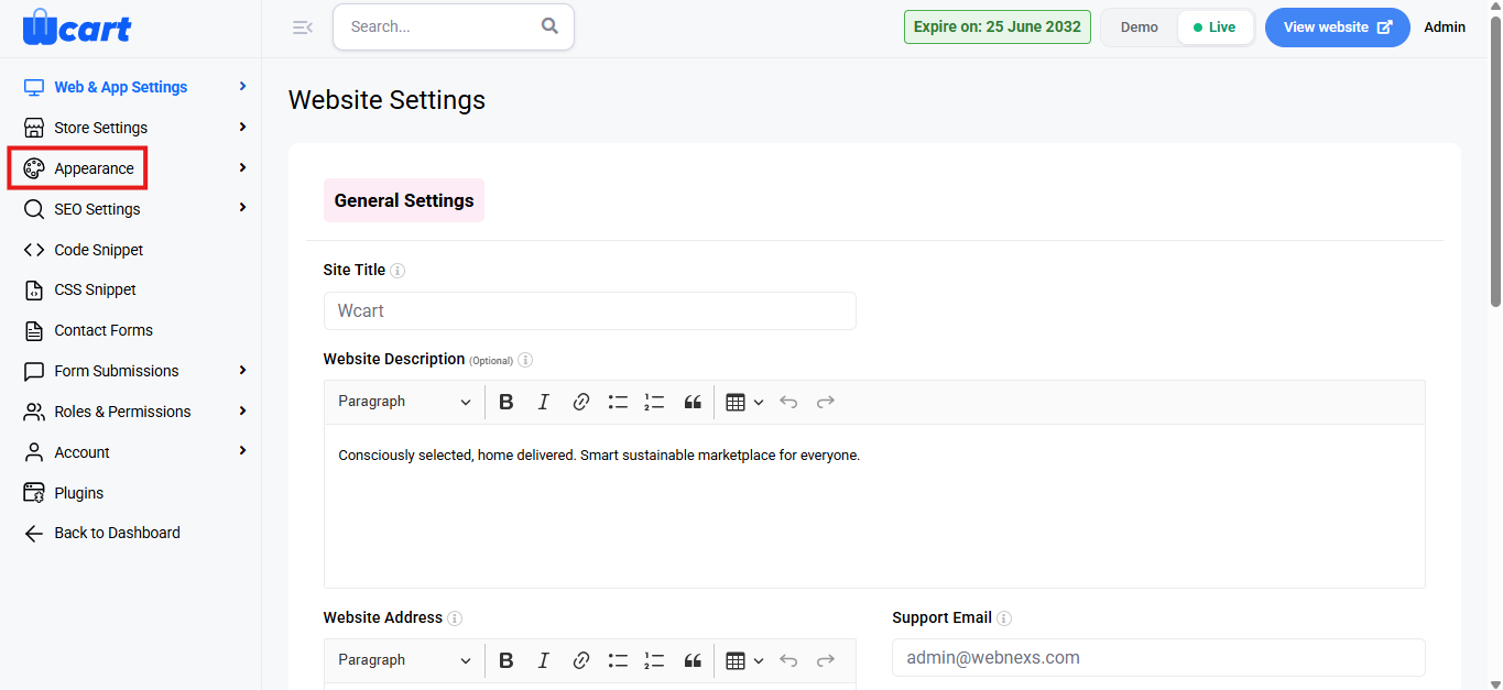
- Next, choose ‘Color Settings’.
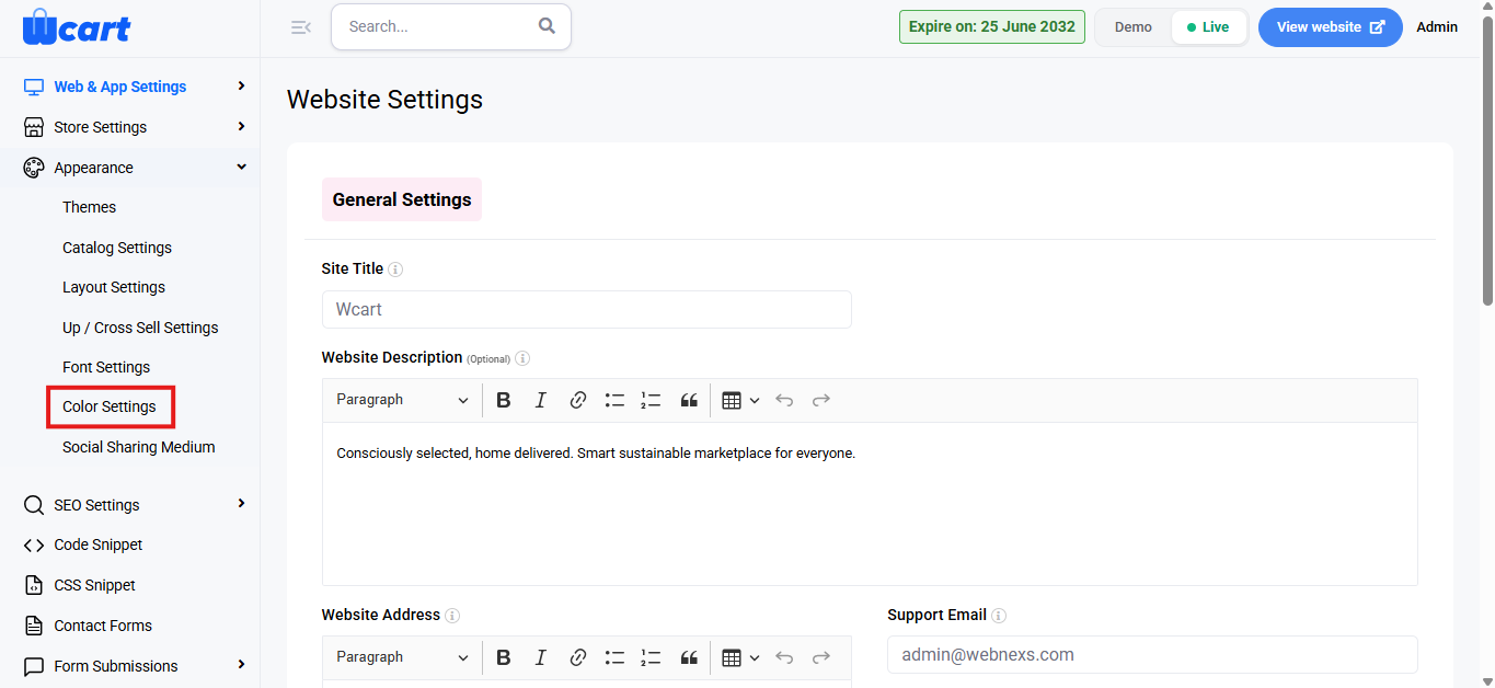
Adjust Global Color Settings:
- Global Color: Base color for your website background.
- Base Color: The general color used for many sections of the site.
- Primary Color: Typically used for buttons, links, and main action items.
- Secondary Color: An additional color used for different page elements or accents.
- Alert Color: Used for warning or error messages (usually red).
- Success Color: Used for success messages, typically green.
- Warning Color: Used for yellow alerts or notices.
- Link Color: The color of hyperlinks on your site.
- Link Hover Color: The color of hyperlinks when hovered over.
- Divider Color: Color for dividers or borders between sections.
- Dark Color: Color used for dark elements, such as dark mode background.
Color Customization:
- Click on each color box next to the respective label to open the color picker.
- You can adjust the color by either selecting from the predefined swatches, entering a hex code or using the color slider.
- Once you select the color, it will automatically update in the field.
Preview Changes: The changes you make will reflect immediately in the preview area, giving you a live look at how the website will appear with the new settings.
Submit: A toast notification ‘Global color updated successfully’ will appear to confirm the addition.
Customizing the colors helps align the user interface with your brand, giving a consistent and personalized experience.