
This section enables you to easily apply custom styles to your website, ensuring a consistent and personalized design. This flexibility enhances the overall user experience by allowing tailored visual adjustments.
To configure, follow these steps:
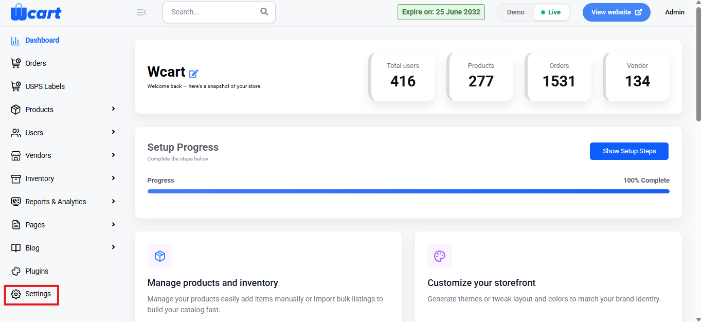
- Navigate to the sidebar menu, click ‘Settings’.
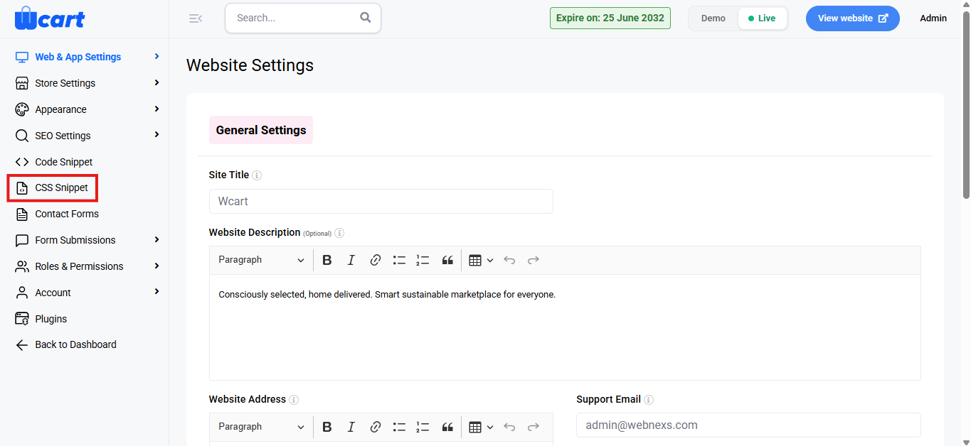
- Select ‘CSS Snippet’.
You have three main fields to add your custom CSS for different device types:
All Devices:
- This section allows you to apply custom CSS that will affect your website on all devices (desktop, tablet, mobile).
- Paste your CSS code in this box to ensure global styles across all devices.
Tab:
- Use this section to add custom CSS that will apply when your website is viewed in tablet mode.
- This allows you to tweak your layout or style for tablets specifically.
Mobile:
- This section is for custom CSS that applies when your website is viewed on mobile devices.
- You can modify elements such as font size, spacing, and layout to better fit smaller screens.
This customization allows you to make precise adjustments for a more engaging and professional web experience.