Looking for something? Search Here..


Generic selectors

Exact matches only

Search in title

Search in content

Post Type Selectors

Author: Shilpa Suganthi

  • Email Templates

    Email Templates

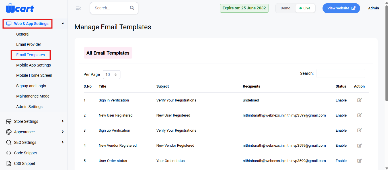
    This section allows administrators to manage all system-generated email templates used for different store events. It provides options to view, edit, and configure template details such as subject, recipients, and content, ensuring each automated email is consistent with your brand communication.

    To configure, follow these steps:

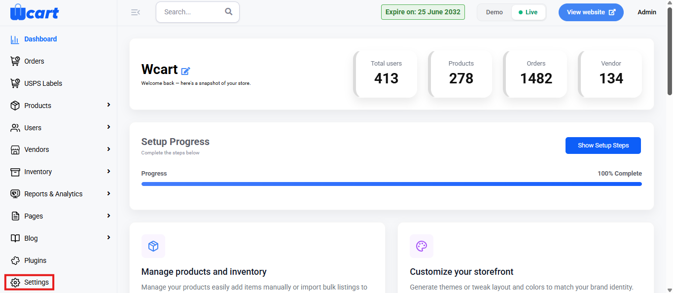
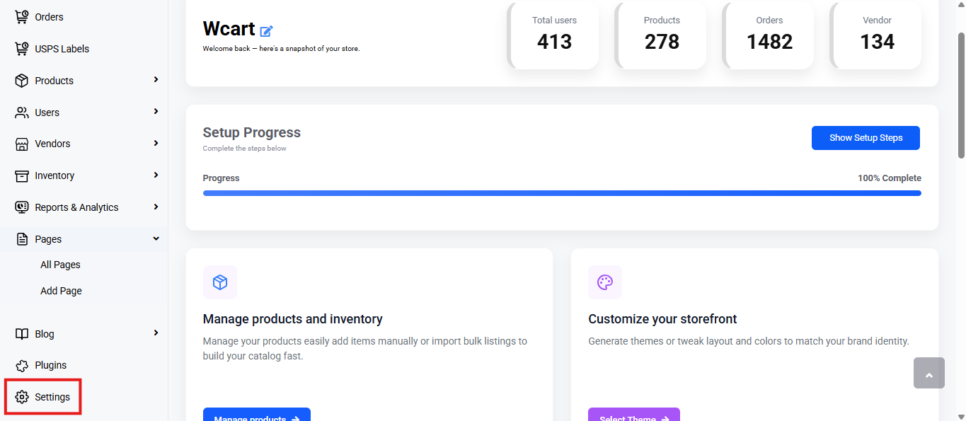
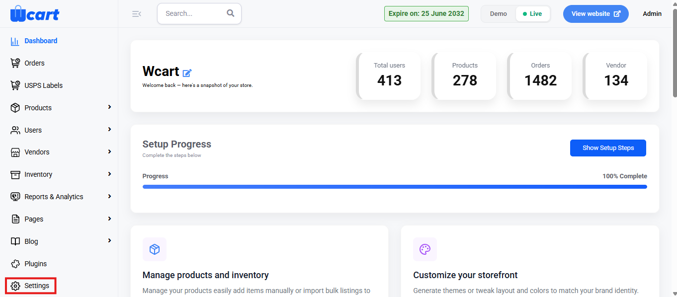
    • Navigate to the sidebar menu and find the ‘Settings’ section.
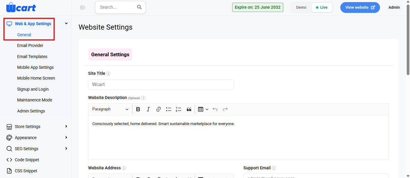
    • Click ‘Web &  App Settings’.
    • Select ‘Email Templates’ from the submenu.

    Now, click on ‘View Email Templates’ in the top-right corner of the page to return to the All Email Templates section, where you will find a table with various columns to interpret email template data quickly and accurately. The columns are listed below:

    • S.No: Serial number of the email template within the current page view.
    • Title: Name of the email template, typically based on the triggered event.
    • Subject: Subject line used in the outgoing email.
    • Recipients: The email addresses receiving the message. It can include one or multiple recipients.
    • Status: Indicates whether the template is currently active.
      • Enable: The template is active and will be used when its corresponding event is triggered.
      • Disable: The template is inactive and will not be triggered until re-enabled.
    • Action: Edit icon opens the editor to customize the email content. The form sections and fields are mentioned below:

    Basic Details

    • Title: Displays the name of the selected email template. This field is non-editable.
    • Subject: Enter the subject line of the email that the end user will see in their inbox.
    • Recipient: Specify the email address(es) that should receive this template. Leave blank if dynamically handled.
    • Content: This is the email body editor where you can write and format the message content using the rich text editor.
    • Short Tags: These dynamic placeholders are replaced with actual values when the email is sent.
    • Email Template Status: Controls whether this specific template is active.
      • Enable: The template will be triggered during the corresponding event.
      • Disable: No email will be sent for this event.
    • Update: Save your changes and apply. A toast notification ‘Email Template Updated Successfully’ will appear to confirm the update.
    • Cancel: Discards changes and returns you to the main Email Templates list.

    These settings help maintain professional and consistent email communication across all system events. Review each template carefully, update as needed, and save your changes to ensure all automated messages are correctly formatted and delivered.

  • Tax Settings

    This section allows administrators to configure and manage tax settings for the store. It includes options to define general tax rules, add or edit tax rates, and control how taxes are displayed and applied during transactions.

    To configure, follow these steps:

    • Navigate to the sidebar menu and find the ‘Settings’ section.
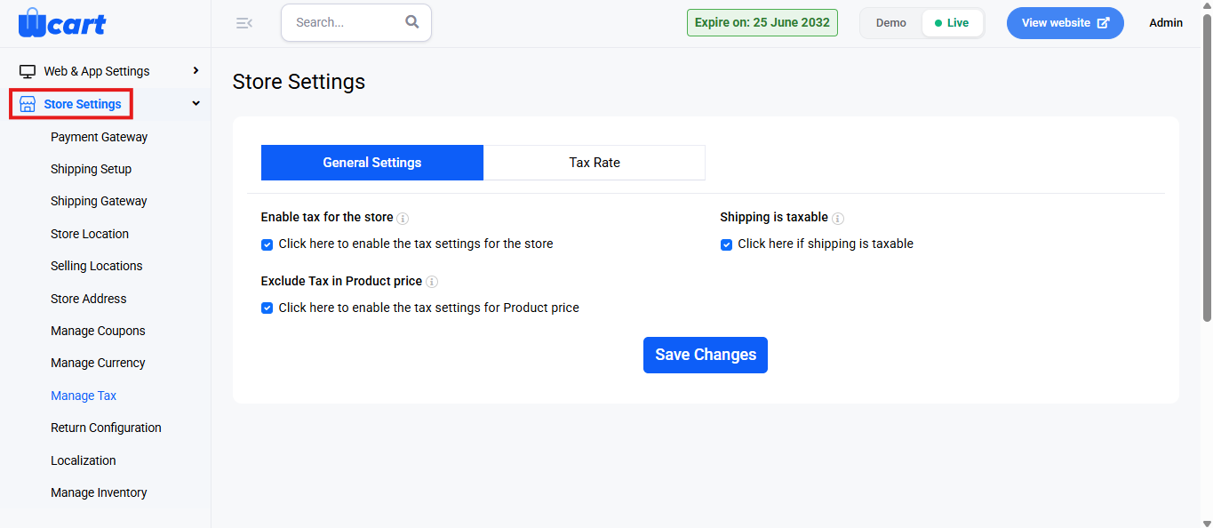
    • Click ‘Store Settings’.
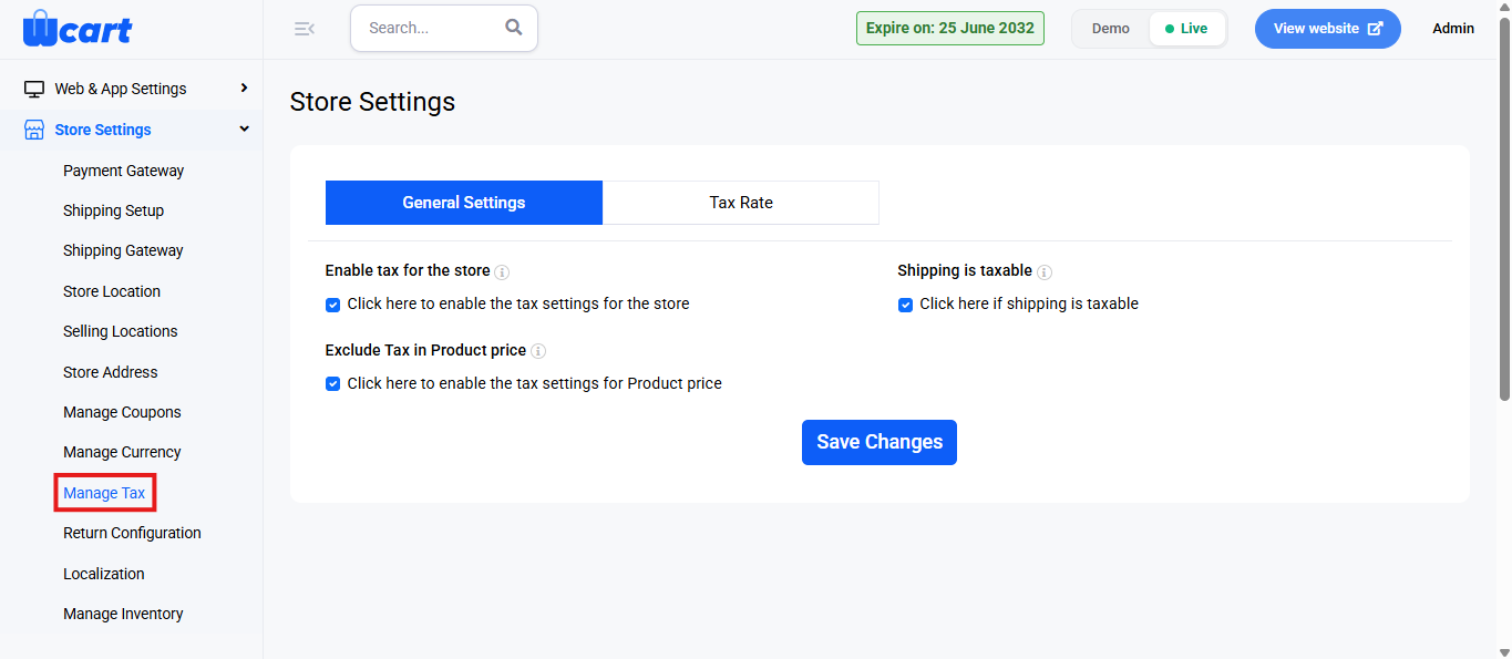
    • Select ‘Manage Tax’ from the submenu.
    • You will find the following options to configure under ‘General Settings’:
    • Enable tax for the store: Enables the entire tax functionality.
    • Shipping is taxable: Determines whether tax should be applied to the shipping charges.
    • Exclude Tax in Product Price: When enabled, tax is calculated in addition to the product price.
    • Save Changes: Save the changes. A toast notification ‘General Setting Updated Successfully’ will appear to confirm the update.

    Configure the tax rate by clicking ‘Tax Rate’ from the tab groups:

    Tax Rate

    Export

    Click the Export icon located at the top-right corner of the Tax Rate tab to initiate the download process for all existing tax rate records. A modal dialog box ‘Select file format to Export’ will appear with the these two options:

    • CSV 
    • Excel

    Export: Choose either one to directly download the data to your system.

    Cancel: Click to return to the tax rate list view.

    Import

    • Click to open the Bulk Upload section.
    • A section titled ‘Import Tax From CSV File’ will open. Below the label you will find a step progress bar displayed with the below mentioned options:
      • Upload CSV File: Drag and drop your product CSV file. For reference purposes, you can view a Sample CSV by navigating to the top right to download a template CSV file by clicking on ‘Sample CSV’. Click on ‘Submit’ to move to the next step in the progress bar. 
      • Column Mapping: The Column Mapping step is the second phase in the bulk upload process. After you upload a CSV file, this section allows you to match each column in your CSV with the appropriate address field used by the system. Below is what each field represents:
        • Country Code: Map this to the column that contains the country identifier for each tax record.
        • State Code: Select the column that includes the state or region code associated with the entry.
        • Postal Code: Map this to the column containing the postal or ZIP codes.
        • City Code: Choose the column that lists the city identifiers.
        • Percentage Rate: Map this to the column that holds the applicable tax percentage for the location.
        • Tax Code: Select the column containing the tax type name or code.

    After mapping all fields correctly, click the ‘Submit’ button at the bottom. The system will begin importing the product data using the mapped fields. Click ‘View Tax’ to return to the ‘General Settings’ page.

    + Tax rate

    • Country: Pre-filled as India. Select the country where the tax applies.
    • Pin code: Enter the area-specific postal code.
    • State: Dropdown list to select a state.
    • City: Dropdown list to select the target city.
    • Percentage Rate: Enter the applicable tax rate as a percentage. Only numeric values are accepted.
    • Tax Name: Give the tax a name for identification purposes.
    • Cancel: Redirects to the General Settings tab.
    • Submit: A toast notification ‘Tax Rate Added Successfully’ will appear to confirm the addition.

    Tax-Settings

    Navigate to the top right corner of the page and click this button to return to the General Settings tab.

    You will find a table with various columns to interpret tax rate data quickly and accurately. The columns are listed below:

    • Country Code: Code of the country where the tax is applicable.
    • State Code: Code of the applicable state or region.
    • Postal Code: Area PIN or ZIP where tax is enforced.
    • City Code: Specific city where the tax rule applies.
    • Rate of %: The tax rate as a percentage value.
    • Tax Name: Custom name for the tax.
    • Action: Icons for managing each tax rate:
    • Edit : The same fields in ‘Add Tax’ are available to edit and update.
    • Delete: Deletes the tax entry. A toast notification ‘Deleted Tax Rate’ will appear to confirm deletion.

    These settings ensure that all tax calculations, rates are applied accurately across the store. Review each configuration carefully and save your changes to maintain compliance and consistency before proceeding to the next setup section.

  • Managing Currency & Multi-Currency Options

    This section allows administrators to configure and manage multiple currencies for the store. It provides options to enable multi-currency support, define exchange rates, and maintain details for each currency used in transactions.

    Accessing the Manage Currency Settings

    To configure, follow these steps:

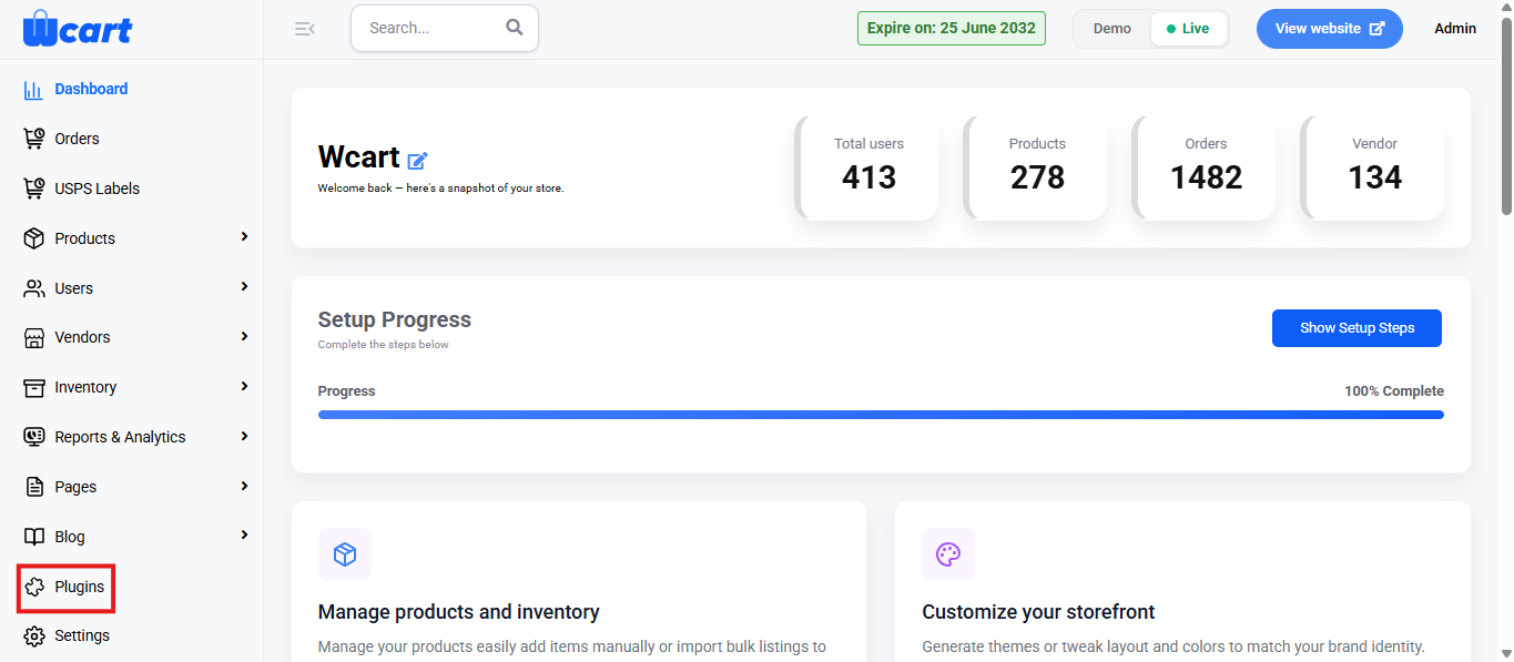
    • Go to the Dashboard and select ‘Plugins’ from the sidebar menu.
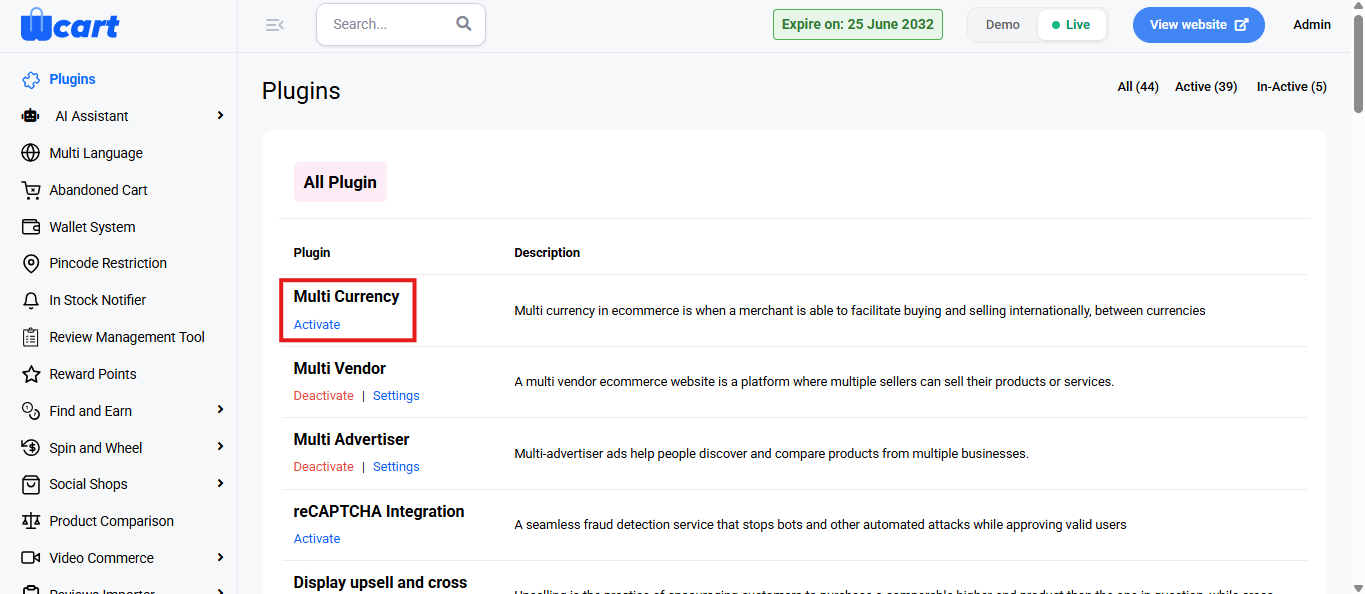
    • Locate the Multi Currency plugin in the list.
    • Click ‘Activate’. You will now see two options: ‘Deactivate’ and ‘Settings’. A toast notification showing ‘Multi Currency Plugin Activated’ or ‘Multi Currency Plugin Deactivated’ will appear to confirm that the plugin has been activated or deactivated. You can configure the Multi Currency settings by clicking ‘Settings’ after activation.

    Manage Currency Section

    This section provides control over enabling or disabling multi-currency support and selecting the default store currency.

    • Default Currency:

    Displays the primary currency used in the store.

    The Edit icon allows modification of the default currency.

    • Enable Multi Currency:

    Selecting this option allows customers to view prices and complete transactions in various currencies.

    Deselecting it restricts transactions to a single default currency.

    • Choose Currency Section

    This section is used to add or remove active currencies available in the store.

    • Available Currencies:

    The dropdown field lists available currency codes.

    Selected currencies appear as tags.

    The ‘x’ icon beside a tag removes that currency from the active list.

    Click ‘Update’ to apply the latest selections.

    List of Currency

    This table displays all active currencies configured in the system.

    Columns:

    • Currency Code: ISO code representing the currency.
    • Currency Symbol: Symbol associated with the currency.
    • Currency Value: Conversion rate relative to the default currency.
    • Currency Name: Full name of the currency.
    • Action: Icons for editing or deleting currency entries.

    Actions:

    • Edit: Opens the currency details for modification.
    • Delete: Removes the currency from the list after confirmation.

    Add Currency

    Select the + Currency’ icon to open the ‘Add Currency’ popup form.

    Fields:

    • Currency Name: Full name of the currency. (Required)
    • Currency Code: Official ISO code. (Required)
    • Currency Value: Conversion rate compared to the base currency. (Required)
    • Currency Symbol: Symbol representing the currency. (Required)
    • Currency Decimal (Optional): Number of decimal places displayed.
    • Currency Symbol Position (Optional): Placement of the symbol (before or after the value).
    • Status: Defines whether the currency is Enabled or Disabled
    • Currency Flag (Optional): Flag image representing the associated country or region.

    After entering the details, select ‘Save Changes’ to add the new currency, or choose Close to cancel.

    Edit Currency

    The Edit icon beside each currency entry allows modification of currency details.

    Editable Fields:

    • Currency Name
    • Currency Code
    • Currency Value
    • Currency Symbol
    • Currency Decimal (Optional)
    • Currency Symbol Position (Optional)
    • Status
    • Currency Flag (Optional)

    Once edits are complete, select ‘Save’ to update the information.

    Delete Currency

    • Selecting the Delete icon removes a currency from the list.
    • A confirmation message appears stating: “Are you sure you want to delete this currency?”
    • Select ‘OK’ to confirm or ‘Cancel’ to abort the action.

    Currency Logs

    This section displays the record of all automatic and manual updates related to currency configurations.

    Columns:

    • S.No: Serial number for each entry.
    • Currency Log Status: Outcome of the update.
    • Latest Updated: Timestamp of the last modification.
    • Currency Log Response: System feedback message.

    These settings ensure accurate pricing and a consistent shopping experience across different currencies. Ensure all details are configured correctly and saved before moving to the next configuration sections.

  • Managing Store Details

    General Store Settings

    This section can be used to establish your store’s core presence and identity. It provides the basic configuration that defines your website’s appearance and overall behavior. Setting this up ensures your platform is aligned with your brand and ready for customers.

    To configure, follow these steps:

    • Navigate to the sidebar menu and find the ‘Settings’ section.
    • Click ‘Web & App Settings’.
    • Select ‘General Settings’ from the submenu.

    The fields available on this page are listed below:

    Store Identity & Contact Information:

    • Site Title: Enter the name of your website. This will be displayed in the browser title bar and across various site areas.
    • Website Description (Optional): Provide a short description about your website.
      This will be used in various display sections and can help convey your brand purpose.
    • Website Address: Enter your website’s URL or domain address.
    • Support Email: Enter the email address where customers can reach you for support.
    • Support Contact: Enter the phone number for customer support. Include the country code if needed.
    • WhatsApp Contact: Provide a WhatsApp number for instant customer support and inquiries.

    Logo and Branding Settings:

    • Primary Logo – Original Version: Click ‘Choose File’ to upload the main website logo.
    • Light Version: Upload the logo version suitable for light backgrounds.
    • Dark Version: Upload the logo version suitable for dark backgrounds.
    • Favicon: Upload a favicon icon. This small icon appears in the browser tab next to the site title.
    • Logo Width: Enter the width of the displayed logo in pixels.
    • Logo Height: Enter the height of the displayed logo in pixels.

    Application Store Links (If Applicable):

    • Google Play URL: Enter the app link if your platform has an Android mobile app.
    • App Store URL: Enter the app link if your platform has an iOS mobile app.

    Search Engine Visibility:

    Choose whether the website should be visible to search engines.

    • Yes: The website will be indexable and discoverable by search engines.
    • No: The website will be hidden from search engine indexing.

    Save Changes:

    After filling all required fields, click ‘Submit’ to save the settings. A confirmation toast notification will appear to indicate that the settings have been updated successfully.

    If you wish to discard changes, click ‘Cancel’.

    Links to other menus under Web & App Settings:

    • Recaptcha Settings
    • Email Settings
    • Email Templates
    • Mobile App Settings
    • Mobile Screen Settings
    • Signup and Login settings

    These settings help maintain a consistent and professional identity for your store. Ensure all details are filled correctly and saved before moving to the next configuration sections.

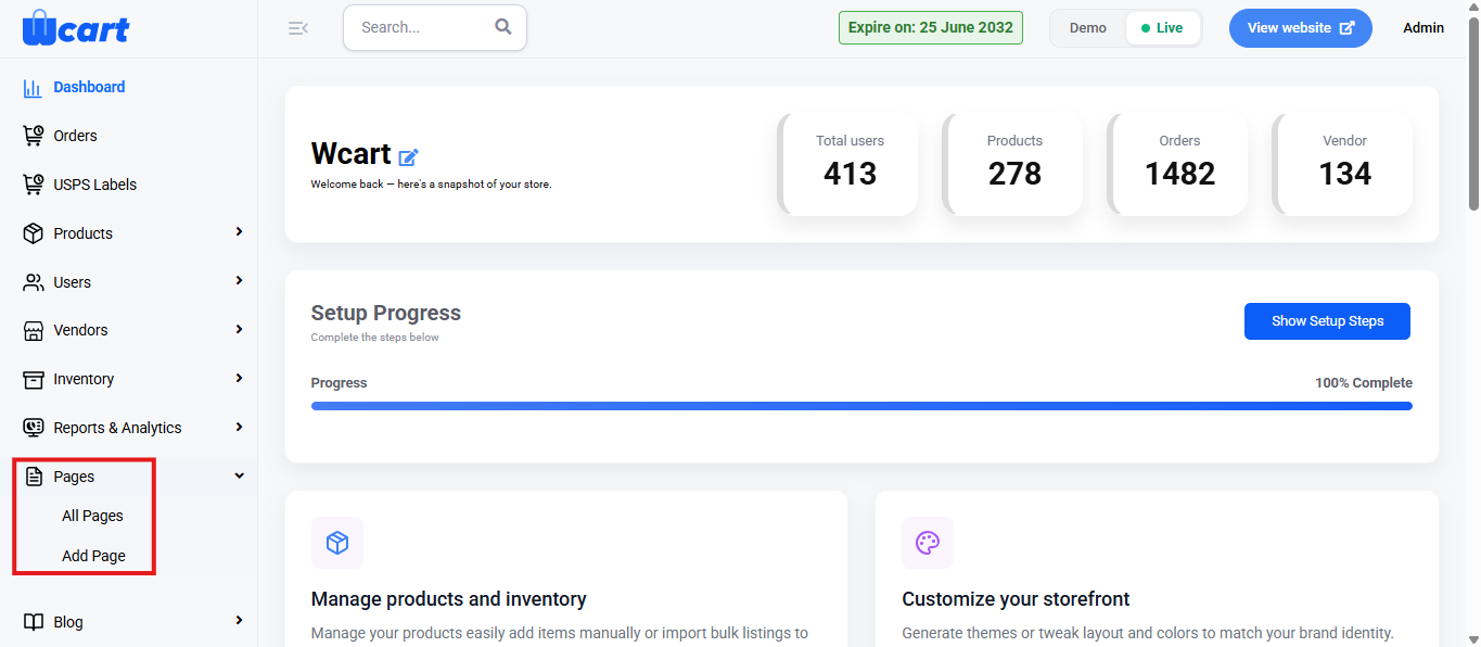
  • Pages

    This module allows administrators to view and manage all static pages on the platform. These pages can be either system-generated or manually created CMS pages.

    To configure, follow these steps:

    • Navigate to the sidebar menu and select ‘Blogs’.
    • You can add, manage and view blogs, as well as add, manage and view blog categories.

    All Pages

    This section displays a list of all created pages along with their associated details and management options.

    Add Page

    Click the ‘+ Add Page’ button to manually add a new page. You will be directed to the ‘Add New Page’ page with the following form fields:

    Basic Details

    • Title: Specifies the name of the page. 
    • Description: Text editor that allows you to enter and format the content of the page. 

    Meta Details

    • Meta Title: Title shown in browser tabs and search engine results. 
    • Meta Keyword: Enter SEO-related keywords that describe the page’s content. 
    • Meta Description: Summary that may appear in search engine result previews. 
    • Short Tags: Predefined dynamic tags that auto-fill meta fields using global SEO settings.
    • Page Status: Dropdown to set the visibility state of the page:
      • Publish: The page is live and accessible on the site.
      • Draft: The page is saved but not yet visible publicly.
    • Cancel: Discards the changes and returns to the previous page.
    • Submit: A toast notification ‘Page Added Successfully’ will appear to confirm the addition.

    Now, return to the All Pages section, where you will find a table with various columns to interpret page data quickly and accurately. The columns are listed below:

    • S. No: Serial number of the page in the list.
    • Title: Name of the page.
    • Slug: The URL identifier used to access the page.
    • Type: Specifies the category of the page within the system.
      • General Page: System-defined pages used for core functions.
      • CMS: Admin-created content pages for informational purposes.
    • Status: Indicates the status of the product.
      • Draft: Product is saved as a draft and is not visible to customers. 
      • Publish: Product is live and visible in the storefront for customers to purchase.
    • Action:
      • View the page: Redirects to the storefront page available for the public to view.
      • Edit the page: All the fields in ‘Add Page’ will be displayed to edit.
      • Pencil icon: Clicking the pencil icon redirects you to the homepage layout editor. This page allows you to customize the content sections of the storefront homepage.

    In addition to viewing and managing all existing pages, the platform provides a dedicated option to directly add a new page for faster setup.

    Add Page

    NOTE: It contains the same form fields present in the ‘Add Page’ form section in the previous sidebar menu. 

    This section helps to create, edit, and manage all static pages while controlling their content and visibility across the platform.

  • Inventory

    This module provides an overview of stock management, covering product availability, storage, and distribution across different locations.

    Territory

    Define and manage service areas based on geographical regions.

    + Territory

    Click the ‘Add Territory’ option to manually enter a new territory. You will be directed to the page with the following form sections and fields:

    Territory Details

    Territory Name: Enter a unique name for the territory. This is a required field.

    Territory Radius: Define the service radius (in km) for the territory. Required to determine coverage.

    Territory Location

    Location Title: Give a descriptive name for the territory’s central point or location. Required for reference.

    Mobile Number: Input the contact mobile number for the territory manager. Country code is pre-filled.

    Contact Person Name: Enter the name of the person responsible for this territory. This is a required field.

    Email ID: Provide the email address of the contact person.

    Address Line 1: Add the street address or premises information.

    Country: Auto-filled based on system configuration.

    State: Select the appropriate state from the dropdown list.

    City: Choose the city associated with the territory.

    Pincode: Enter the area’s postal/ZIP code.

    Google Map URL: Add a Google Maps link for precise location tracking, if needed.

    Status: Choose whether the territory should be marked as Enable (active) or Disable (inactive).

    Confirmation & Submit

    Cancel Button: Discards the current form inputs and returns to the previous screen.

    Submit Button: Click to save the territory information. Upon submission, a toast notification such as ‘New Territory Added Successfully’ will confirm the addition. The page returns to the territory list view.

    Below these controls you will find a table with various columns to interpret territory data quickly and accurately. The columns are listed below:

    S.No: Serial number indicating the row position in the current view.

    Territory Name: Name assigned to the territory for identification.

    Territory Radius: The coverage area of the territory in kilometers.

    Location Title: Descriptive label or address for the territory’s central location.

    Contact Person Name: Name of the person assigned to manage or coordinate the territory.

    Action: Manage by editing or deleting.

    Edit: The same form sections and fields in the ‘Add Territory’ page will appear.

    Delete: Deletes the category. A dialog box will appear with the text ‘Do you really want to delete the page?’ along with ‘Ok’ and ‘Cancel’ options. Canceling will remove the dialog box and clicking on ‘Ok’ will display this toast notification ‘Deleted Territory’ to confirm deletion.

    Showing entries

    Indicates the starting and ending index of currently displayed items and the total count. Showing 1 to 1 of 1 entries means only one record is available and shown.

    Pagination Controls

    Navigation buttons for moving between multiple pages of entries.

    Previous: Moves to the page before the current one (disabled on the first page).

    1: Indicates the current page number.

    Next: Moves to the next page (disabled if there are no more pages).

    After defining territories, warehouses can be created to establish storage points that support order fulfillment and logistics operations.

    WAREHOUSE

    Create and manage physical storage points assigned to specific territories for order fulfillment and logistics operations.

    +New Warehouse

    Click the ‘Add Warehouse’ option to manually add a new warehouse. You will be directed to the page with the following form sections and fields:

    Choose Territory: Assign the warehouse to its corresponding territory.

    Location Title: Enter the name or description of the warehouse location.

    Contact Person Name: Input the name of the primary contact person for this warehouse.

    Address Line 1: Enter the full street address of the warehouse.

    Country: Indicates the country in which the warehouse operates.

    Pincode: Enter the area’s postal or ZIP code.

    State: Choose the relevant state from the dropdown.

    City: Select the city where the warehouse is located.

    Google_map_url: Optionally include a link to the warehouse’s exact location on Google Maps.

    Email ID: Provide the email address of the warehouse’s contact person.

    Mobile Number: Input the mobile number with pre-filled country code.

    Landline Number: Enter the warehouse’s landline number using the default country and area codes.

    Default Location: Choose whether this warehouse should be set as the default for the assigned territory.

    Warehouse Status: Set the status as Active or Inactive to enable or disable warehouse availability.

    Cancel: Discards the form input and returns to the warehouse list page.

    Submit: Click to save warehouse information. A toast notification ‘New Warehouse Address Added Successfully’ will appear to confirm the addition.

    Per Page (In the warehouse list view page)

    It controls the number of vendor records displayed on a single page. To adjust this setting, follow the steps mentioned below:

    Navigate to the ‘Per Page’ label at the top left corner of the vendor table.

    The dropdown menu will show you options to display 10, 25, 50, or 100 vendors per page.

    Choose the number of vendors you want to display per page.

    The table will automatically refresh to show the selected number of per vendors page.

    Search (In the warehouse list view page)

    You can search vendors by entering specific order details to quickly locate the needed information. To adjust this setting, follow the steps mentioned below:

    Navigate to the ‘Search’ box on the top right corner of the vendors table.

    The system will automatically filter the table based on matching values from your input in any column.

    The table will automatically filter and show only the matching records.

    Below these controls you will find a table with various columns to interpret warehouse data quickly and accurately. The columns are listed below:

    S.No: Serial number indicating the row position in the current view.

    Name: Name of the contact person responsible for the warehouse.

    Location: The warehouse’s physical or titled location used for reference and identification.

    Mobile: Primary mobile number of the warehouse contact person for communication.

    Email: Email address of the warehouse contact person.

    Action: Manage warehouse entries by editing or deleting them.

    Edit: Opens the same form sections and fields as seen on the ‘Add Warehouse’ page to modify the existing warehouse details.

    Delete: Deletes the category. A dialog box will appear with the text ‘Do you really want to delete the page?’ along with ‘Ok’ and ‘Cancel’ options. Canceling will remove the dialog box and clicking on ‘Ok’ will display this toast notification ‘Deleted Warehouse Address’ to confirm deletion.

    Showing entries

    Indicates the starting and ending index of currently displayed items and the total count. ‘Showing 1 to 1 of 1 entries’ means only one record is available and shown.

    Pagination Controls

    Navigation buttons for moving between multiple pages of entries.

    Previous: Moves to the page before the current one (disabled on the first page).

    1: Indicates the current page number.

    Next: Moves to the next page (disabled if there are no more pages).

    After creating warehouses, products can be mapped to each warehouse to maintain a consolidated view of stock levels across locations.

    WAREHOUSE BASED PRODUCTS

    Consolidated view of inventory levels across all warehouse locations.

    Change Location:

    Dropdown at the top-right allows filtering inventory by warehouse location.

    Selecting a location changes the list of products shown, displaying inventory specific to that warehouse.

    If no location is selected, the table shows All Warehouse Inventory Data.

    The Filter dropdown allows you to narrow down the inventory list based on:

    Filter

    Availability

    All: Displays all products regardless of stock level.

    In Stock: Shows only products with available quantities greater than zero.

    Out of Stock: Shows only products with zero availability.

    Product Type

    All: Displays all product types.

    Simple: Shows products that have a single variant.

    Variable: Shows products with multiple variants (e.g., size, color).

    Per Page (In the warehouse list view page)

    It controls the number of vendor records displayed on a single page. To adjust this setting, follow the steps mentioned below:

    Navigate to the ‘Per Page’ label at the top left corner of the vendor table.

    The dropdown menu will show you options to display 10, 25, 50, or 100 vendors per page.

    Choose the number of vendors you want to display per page.

    The table will automatically refresh to show the selected number of per vendors page.

    Search (In the warehouse list view page)

    You can search vendors by entering specific order details to quickly locate the needed information. To adjust this setting, follow the steps mentioned below:

    Navigate to the ‘Search’ box on the top right corner of the vendors table.

    The system will automatically filter the table based on matching values from your input in any column.

    The table will automatically filter and show only the matching records.

    Below these controls you will find a table with various columns to interpret all warehouse inventory data quickly and accurately. The columns are listed below:

    SKU: Unique identifier assigned to each product for inventory tracking purposes.

    Product Name: Title of the product associated with the SKU.

    Price: Selling price of the product listed in the system.

    Incoming: Quantity of products currently in transit or expected to be added to inventory.

    Committed: Number of units already reserved or allocated for customer orders.

    Available: Remaining stock quantity that is currently available for new orders after considering committed stock.

    Action:

    View Inventory: Clicking the eye icon under the Action column opens the Store Settings screen which displays:

    Product SKU

    Product Name

    Warehouse Location

    Incoming Quantity

    Committed Quantity

    Available Quantity

    Additional Options on this screen:

    All Inventories: Navigates to a view showing product inventory data across all warehouses.

    View Product: Opens the product’s public-facing page on the website for detailed customer view.

    Update Quantity: Opens a dropdown to choose between increasing or decreasing stock levels.

    Increase: Opens a popup to enter the quantity to be added and a description.

    After entering values, click Save. A toast message ‘Updated Inventory Details’ will appear to confirm the update.

    Decrease: Opens a popup to enter the quantity to be reduced and a description. After entering values, click Save. A toast message ‘Update Inventory Details’ will appear to confirm the update.

    History: Displays the chronological log of all inventory activities performed for the selected product.

    Date: The date and time when the activity occurred.

    Activity: Type of inventory action performed.

    Incoming: Quantity was increased.

    Outgoing: Quantity was decreased.

    Other: Non-quantity-related action.

    Activity Description: Custom text added by the user during the update for tracking or clarification.

    Activity Quantity: Number of units added to or removed from the inventory.

    Available: Available stock count after the activity was completed.

    Close: Closes the Product History window.

    Showing entries

    Indicates the starting and ending index of currently displayed items and the total count. “Showing 1 to 1 of 1 entries” means only one record is available and shown.

    Pagination Controls

    Navigation buttons for moving between multiple pages of entries.

    Previous: Moves to the page before the current one (disabled on the first page).

    1: Indicates the current page number.

    Next: Moves to the next page (disabled if there are no more pages).

    NOTE: The ‘Store Based Products’ side menu also contains the same form sections and fields as ‘Warehouse Based Products’ to provide a consolidated view of inventory levels across all store locations.

    After reviewing warehouse-based product inventories, store locations can be set up to track stock availability across physical outlets.

    STORE LOCATIONS

    Manage physical store location details that are linked to inventory and territory-based operations.

    +Store Location

    Click the ‘Add Store Location’ option to manually add a new store location. You will be directed to the page with the following form sections and fields:

    Location Title: Name for the store location.

    Contact Person Name: Person in charge of this location.

    Select Territory: Choose the predefined territory for the store.

    Select Warehouse: Link this location with a warehouse.

    Address: Full address of the store.

    Email Id: Contact email for this store.

    Mobile Number: Contact mobile number.

    Country: Auto-filled or selectable country.

    Pincode: ZIP or postal code of the location.

    State: Choose from available states.

    City: Choose the city from the dropdown.

    Google Map URL: Insert the Google Maps link for precise location reference.

    Save Changes: Submit the form to save or update the store details. A toast notification ‘New Store Location Added Successfully’ will appear to confirm the addition.

    Cancel: Discard changes and return to the list.

    Below these controls you will find a table with various columns to interpret store locations data quickly and accurately. The columns are listed below:

    S.No: Auto-generated serial number for each entry.

    Location Title: Name given to the store location.

    Contact Person Name: Person responsible for that location.

    Action: Manage by editing or deleting.

    Edit: All the fields are the same as the ‘Add Store Location’ form section.

    Delete: Deletes the category. A dialog box will appear with the text ‘Do you really want to delete the page?’ along with ‘Ok’ and ‘Cancel’ options. Canceling will remove the dialog box and clicking on ‘Ok’ will display this toast notification ‘Deleted Store Location’ to confirm deletion.

    Per Page (In the warehouse list view page)

    It controls the number of vendor records displayed on a single page. To adjust this setting, follow the steps mentioned below:

    Navigate to the ‘Per Page’ label at the top left corner of the vendor table.

    The dropdown menu will show you options to display 10, 25, 50, or 100 vendors per page.

    Choose the number of vendors you want to display per page.

    The table will automatically refresh to show the selected number of per vendors page.

    Search (In the warehouse list view page)

    You can search vendors by entering specific order details to quickly locate the needed information. To adjust this setting, follow the steps mentioned below:

    Navigate to the ‘Search’ box on the top right corner of the vendors table.

    The system will automatically filter the table based on matching values from your input in any column.

    The table will automatically filter and show only the matching records.

    Below these controls you will find a table with various columns to interpret all warehouse inventory data quickly and accurately. The columns are listed below:

    Showing entries

    Indicates the starting and ending index of currently displayed items and the total count. “Showing 1 to 1 of 1 entries” means only one record is available and shown.

    Pagination Controls

    Navigation buttons for moving between multiple pages of entries.

    Previous: Moves to the page before the current one (disabled on the first page).

    1: Indicates the current page number.

    Next: Moves to the next page (disabled if there are no more pages).

    After setting up store locations, performance insights can be monitored through reports and analytics to evaluate sales, customer activity, and overall business growth.

  • USERS

    This section provides centralized management of all registered users, allowing the addition, viewing, and updating of user details.

    Export:

    Click to display the dropdown format options:

    CSV

    Excel

    Click the radio button to choose your preferred file format.

    Once you have selected a format, click the ‘Export’ button to download your product data in the chosen file type.

    Add Users

    Manage Users:

    Name: Enter the user's name in the input field provided. This is a mandatory field, not entering the input will display an alert message ‘Please provide User name’.

    Email: Enter the user's email address.

    Phone Number with Country Code: Select the appropriate country code and enter the user's mobile number. This is a mandatory field, not entering the input will display an alert message ‘Please provide User's Phone Number’.

    Password: Set a password for the user. Click the eye icon to view or hide the entered password.

    Profile Image (Optional): Upload a profile image for the user by clicking ‘Choose File’. This is optional.

    Confirmation to Send a Mail: Enable this checkbox to send a confirmation mail to the user upon account creation.

    Submit: Click ‘Submit’ to save the new user information. A toast notification ‘User Details Added Successfully’ will appear to confirm the addition.

    Cancel: Click ‘Cancel’ to discard the entry and return to the user list.

    Per Page

    It controls the number of user records displayed on a single page. To adjust this setting, follow the steps mentioned below:

    Navigate to the ‘Per Page’ label at the top left corner of the user table.

    The dropdown menu will show you options to display 10, 25, 50, or 100 users per page.

    Choose the number of users you want to display per page.

    The table will automatically refresh to show the selected number of users per page.

    Search

    You can search orders by entering specific order details to quickly locate the needed information. To adjust this setting, follow the steps mentioned below:

    Navigate to the ‘Search’ box on the top right corner of the order table.

    The system will automatically filter the table based on matching values from your input in any column.

    The table will automatically filter and show only the matching records.

    Below these controls you will find a table with various columns to interpret order data quickly and accurately. The columns are listed below:

    S.No: Serial number of the user row in the current view.

    User ID: System-generated unique identifier for each user.

    Name: Displays the name of the registered user.

    Email: Email address associated with the user account.

    Phone No: Contact number provided by the user.

    Status: Indicates the current account status of the user. There are three options:

    Active: User's email address has been verified.

    Inactive: User account has been blocked by the administrator.

    Pending: User's email address has not yet been verified.

    Action: Complete view and management options for an individual user account.

    USER DETAILS

    This section with the navigation tabs provides detailed information and administrative controls for managing individual user accounts.

    Profile

    Displays the user’s basic account information such as:

    Name: The full name of the user.

    Email Id: The registered email address.

    Phone Number: The contact number provided by the user.

    Profile Image: Displays the uploaded profile image of the user, if any.

    Actions Available

    A common button available for all navigation tabs that is located at the top-right corner of the page: These buttons allow administrators to manage user account status

    Block This User: Marks the user account as inactive and prevents further access to the platform.

    Active This User: Reactivates a previously blocked user and restores access.

    Status changes are confirmed with toast notifications such as:

    ‘User Blocked Status Updated’

    ‘User Approved Status Updated’

    Pagination Controls

    Navigation buttons for moving between multiple pages of entries.

    Previous: Moves to the page before the current one (disabled on the first page).

    1: Indicates the current page number.

    Next: Moves to the next page (disabled if there are no more pages).

    EDIT USER

    This section allows administrators to update the basic profile details of a selected user.

    Name: Update the user's full name.

    Email: Edit the registered email address.

    Phone Number: Modify the user's contact number (including country code).

    Profile Image: Upload or change the user's profile photo using the Choose File option.

    Actions:

    Cancel: Discards any unsaved changes.

    Submit: Saves the edited user details. Changes are confirmed with this toast notification ‘User Details Updated Successfully’.

    ADDRESS MANAGEMENT

    This section displays the list of addresses associated with the user and allows adding new ones.

    Add New Address: Clicking "Add New Address" opens a form to input address details.

    Address Fields:

    Name: Name of the address holder.

    Email: Email associated with the address.

    Phone Number: Contact number.

    Full Address: Area and street information.

    Country: Shows the country for the address.

    Pincode: Postal code of the address.

    State: Select from the dropdown list.

    City: Select city based on the chosen state.

    District: District of the address.

    Landmark: Nearby identification point or landmark.

    Default Address: Set this address as default – Yes/No.

    Address For: Specify whether the address is for Home or Office use.

    Save Action:

    Save An Address: Submits and saves the entered address details to the user's profile. Address changes are confirmed with this toast notification ‘Your Address Added Successfully’.

    CHANGE PASSWORD

    This popup allows the administrator to update the user's login password.

    Fields:

    New Password: Enter the new password to set for the user.

    Confirm Password: Re-enter the new password to confirm accuracy.

    Action Button:

    Confirm Password: Saves and updates the user’s password if both fields match. Password changes are confirmed with this toast notification ‘Password Updated Successfully’.

    WALLET TRANSACTIONS

    This section displays the user's wallet activity history, including credit and debit transactions linked to their account.

    Per Page

    It controls the number of transaction records displayed on a single page. To adjust this setting, follow the steps mentioned below:

    Navigate to the ‘Per Page’ label at the top left corner of the transactions table.

    The dropdown menu will show you options to display 10, 25, 50, or 100 transactions per page.

    Choose the number of transactions you want to display per page.

    The table will automatically refresh to show the selected number of transactions per page.

    Search

    You can search transactions by entering specific transaction details to quickly locate the needed information. To adjust this setting, follow the steps mentioned below:

    Navigate to the ‘Search’ box on the top right corner of the transactions table.

    The system will automatically filter the table based on matching values from your input in any column.

    The table will automatically filter and show only the matching records.

    Below these controls you will find a table with various columns to interpret transaction data quickly and accurately. The columns are listed below:

    S.No: Serial number of the transaction entry.

    Order ID: Reference order ID linked to the transaction, if applicable.

    Amount: Transaction amount (credited or debited).

    Transaction Type: Indicates the direction of a financial transaction. The two options are:

    Credited: Amount is added to the account balance.

    Debited: Amount is deducted from the account balance.

    Entry Date: Date the transaction was recorded.

    Pagination Controls

    Navigation buttons for moving between multiple pages of entries.

    Showing entries: Indicates the starting and ending index of currently displayed items and the total count. “Showing 1 to 1 of 1 entries” means only one record is available and shown.

    Previous: Moves to the page before the current one (disabled on the first page).

    1: Indicates the current page number.

    Next: Moves to the next page (disabled if there are no more pages).

    REWARD POINTS TRANSACTIONS

    This section lists all reward point activities associated with the user, including earned, used, and remaining points.

    Per Page

    It controls the number of reward point records displayed on a single page. To adjust this setting, follow the steps mentioned below:

    Navigate to the ‘Per Page’ label at the top left corner of the reward points table.

    The dropdown menu will show you options to display 10, 25, 50, or 100 reward points per page.

    Choose the number of reward points you want to display per page.

    The table will automatically refresh to show the selected number of reward points per page.

    Search

    You can search for reward points by entering specific details to quickly locate the needed information. To adjust this setting, follow the steps mentioned below:

    Navigate to the ‘Search’ box on the top right corner of the reward points table.

    The system will automatically filter the table based on matching values from your input in any column.

    The table will automatically filter and show only the matching records.

    Below these controls you will find a table with various columns to interpret reward points data quickly and accurately. The columns are listed below:

    S.No: Serial number of the entry.

    Order ID: Associated order's unique ID.

    Order Map ID: Internal reference mapping ID for the order.

    Earn Points: Number of reward points credited to the user.

    Used Points: Number of reward points redeemed by the user.

    Remaining Points: Balance reward points available.

    Created Date: Date on which the points were issued.

    Expired Date: Date on which the points will expire.

    Action: Provides summary information regarding reward point expirations.

    Expired Points: <expired_points>:: Displays the total number of reward points that have expired.

    Expired Date: <expired_date>: Indicates the specific date on which the mentioned points expired.

    Per Page

    It controls the number of reward point records displayed on a single page. To adjust this setting, follow the steps mentioned below:

    Navigate to the ‘Per Page’ label at the top left corner of the reward points table.

    The dropdown menu will show you options to display 10, 25, 50, or 100 entries per page.

    Choose the number of entries you want to display per page.

    The table will automatically refresh to show the selected number of entries per page.

    Search

    You can search reward point records by entering specific details to quickly locate the needed information. To adjust this setting, follow the steps mentioned below:

    Navigate to the ‘Search’ box on the top right corner of the reward points table.

    The system will automatically filter the table based on matching values from your input in any column.

    The table will automatically filter and show only the matching records.

    Below these controls you will find a table with various columns to interpret reward points data quickly and accurately. The columns are listed below:

    S.No: Serial number of the reward point transaction record.

    OrderId: Order identifier associated with the reward point transaction.

    Points: Number of reward points involved in the transaction.

    Claim Date: Date when the reward points were claimed or the transaction occurred.

    Pagination Controls

    Showing Entries: Indicates the starting and ending index of currently displayed items and the total count. ‘Showing 1 to 1 of 1 entries’ means only one record is available and shown.

    Navigation buttons for moving between multiple pages of entries:

    Previous: Moves to the page before the current one (disabled on the first page).

    1: Indicates the current page number.

    Next: Moves to the next page (disabled if there are no more pages).

    Pagination Controls

    Navigation buttons for moving between multiple pages of entries.

    Showing entries: Indicates the starting and ending index of currently displayed items and the total count. “Showing 1 to 1 of 1 entries” means only one record is available and shown.

    Previous: Moves to the page before the current one (disabled on the first page).

    1: Indicates the current page number.

    Next: Moves to the next page (disabled if there are no more pages).

    NOTE: The orders tab will redirect you to the manage orders section, previously explained.

    Pagination Controls (Manage Users Page)

    Navigation buttons for moving between multiple pages of entries.

    Showing entries: Indicates the starting and ending index of currently displayed items and the total count. “Showing 1 to 1 of 1 entries” means only one record is available and shown.

    Previous: Moves to the page before the current one (disabled on the first page).

    1: Indicates the current page number.

    Next: Moves to the next page (disabled if there are no more pages).

    In addition to viewing and managing all existing users, the platform provides a dedicated option to directly add a new user for faster setup.

    ADD USER

    NOTE: The ‘Add User’ section in the sidebar will display the same form sections as the ‘Add Users’ option available in the ‘All Users’ section.

    After managing your store’s users and their account details, you can move on to handling vendors, ensuring smooth onboarding and oversight of your business partners.

  • PRODUCTS

    MANAGE PRODUCTS

    At the top of this section, you will find quick navigation tabs for easy access:

    • All Products: Displays the complete list of products in your store. (Default view)
    • Live Products: Shows only products with status set to Publish. 
    • Draft Products: Displays only products with status set to Draft.

    NOTE: Live Products and Draft Products navigation tabs display products based on the status and have the same functionalities as All Products.

    All Products 

    The section provides a centralized view of every product listed on the platform. The section offers various ‘Data Table Controls’ to give full control and visibility over the products. 

    • Adjacent to this, you will find the following three options Quick Actions:

    1.Export: 

    • Click to display the dropdown format options:
    • CSV 
    • Excel
    • Click the radio button to choose your preferred file format.
    • Once you have selected a format, click the ‘Export’ button to download your product data in the chosen file type.

    2. Import

    • Click to open the modal dialog box called ‘Bulk Upload’.
    • A dropdown list to select the product type will appear with three options as mentioned below:
    • Simple:
    • You will be redirected to the Bulk Upload page for importing products.
    • A section titled ‘Import Product From CSV File’ will open. Below the label you will find a step progress bar displayed with the below mentioned options: 
    • Upload CSV File: Drag and drop your product CSV file. For reference purposes, you can view a Sample CSV by navigating to the top right to download a template CSV file by clicking on ‘Sample CSV’.Click on ‘Submit’ to move to the next step in the progress bar. A toast notification ‘Bulk Upload Initiated Successfully’ will appear to confirm the upload.
    • Column Mapping: The Column Mapping step is the second phase in the Bulk Product Upload process. After you upload a CSV file, this section allows you to match each column in your CSV with the appropriate product field used by the system.

    Click the ‘Submit’ button at the bottom. Ensure all required fields are correctly mapped before submitting.The system will begin importing the product data using the mapped fields.

    • Import: 

    3. Product 

    Select Product Type

    • Click on the ‘+ Product’ button located adjacent to the ‘Import’ option.
    • In the ‘Select Product Type’ dropdown, choose the desired product type.
    • The available options are:
    • Simple: Basic product with no variations.
    • Variable: Product with different variations 
    • Downloadable: Product that can be downloaded digitally.

    Simple product 

    • Product Name: Enter the name of the product.
    • Select Categories: Identify and select the most appropriate categories for the product’s classification.
    • Primary Category: Set the main category for filtering and navigation purposes.
    • Select Tags: Add searchable keywords or tags related to the product to improve discoverability.
    • Select Brand: Choose the associated brand from the available list.
    • Regular Price: Enter the original price of the product.
    • Tax Price Excluded with product price (Change): Clicking on ‘Change’ will redirect to the tax settings page to adjust product price tax handling globally.
    • Sale Price: Enter a discounted price, if applicable, for promotions or sales.
    • Tax Price Excluded with product price (Change): Clicking on ‘Change’ will redirect to the tax settings page to adjust product price tax handling globally.
    • Short Description: Provide a brief summary of the product’s highlights.
    • Long Description: Provide a detailed description of the product, including features, benefits, and any other relevant information.
    • Upload Product Images: Drag-and-drop or browse to upload one or more images for the product.
    • Upload Product Video: Click ‘Choose File’ to upload a video related to the product.
    • Save & Continue: Click to add this new product to the list. A toast notification ‘Added Simple Product Successfully’ will appear to confirm the new addition.

    Product Inventory

    • Product SKU: Enter a unique code used for tracking and identification of the product.
    • Stock Quantity: This is a spinner input field. Enter the current available inventory of the product by typing or using the up/down arrows.
    • Low Stock Limit: This is a spinner input field. Enter the threshold quantity at which notification must be sent about low stock by typing or using the up/down arrows.
    • Track Quantity: Check this box to enable tracking of the product’s quantity.
    • Continue selling when out of stock: Check this box if customers must be allowed to purchase the product even when it’s out of stock.
    • Barcode: Manage the product barcode. A form modal titled ‘Barcode’ will appear with the dropdown list form field titled ‘Select Update Barcode Options’ with the below mentioned dropdown list options:
    • Enter or Scan Barcode: Manually input an existing barcode number or use a barcode scanner to enter it.
    • Upload Barcode Image: Upload an image file of an existing barcode.
    • Generate New Barcode: Auto-generated barcode that is unique is available for download.
    • Cancel: Clicking this button will close the ‘Barcode’ modal dialog box without saving any changes.
    • Save: Click to add this barcode. 
    • Add inventory: Click this button to add more stock to the product’s inventory.
    • Locations: Lists active inventory locations managing stock. Multiple locations can be added and removed using the input field and the remove (×) icon.
    • Add New Location: Allows entry of a new stock location. Enter the location name and click ‘Save’ to add it to the list.
    • Quantity: Displays inventory data categorized by location. Each row in the table shows inventory metrics for the corresponding location. The table includes the following column headers:
    • Locations: Name of the inventory location.
    • Incoming: Quantity of stock currently inbound to the location.
    • Committed: Quantity of stock reserved or allocated to customer orders.
    • Available Stock: Quantity of stock available for purchase and immediate fulfillment.
    • Action: Perform actions such as editing store details.
    • Include Pincodes: Enter the pincode for product delivery. As characters are typed, a validation message ‘Please enter 3 or more characters’ will guide the provision of a sufficient number of characters for valid pincode search or entry.
    • Exclude Pincodes: Enter pincode not serviced for product delivery. As characters are typed, a validation message ‘Please enter 3 or more characters’ will appear, indicating the minimum number of characters required for entry or search.

    Product Shipping Details

    • Shipping Cost: Enter the delivery charges associated with the product.
    • Weight (kg): Enter the product’s total weight. Select the unit of weight (KG, GMS, LBS) from the dropdown.
    • Dimensions (cm): Specify the length, width, and height of the product in centimeters.
    • Save & Continue: Click to add this new product to the list. A toast notification ‘Product Inventory and Shipping Data Updated Successfully’  will appear to confirm the new addition.

    Meta Details 

    • Product Feed: Configures feed-related details for product distribution.
    • Hide from the Feed: Determines if the product is excluded from appearing in the product feed. The following options control this setting:
    • No (Default): Includes the product in the feed.
    • Yes: Excludes the product from the feed.
    • Availability: Defines the current stock status of the product for listing and feed purposes. The following options are available:
    • In Stock: The product is available for immediate purchase and fulfillment.
    • Available for Order: The product is not currently in stock but can still be ordered and will be shipped once available.
    • Pre-Order: The product has not yet been released but can be reserved in advance by placing an order.
    • Out of Stock: The product is currently unavailable for purchase and cannot be ordered.
    • Condition: Indicates the physical state of the product for listing and feed classification. The available options include:
    • New: The product is brand new, unused, and in original packaging.
    • Refurbished: The product has been restored to a like-new condition by the manufacturer or a certified provider.
    • Used: The product has been previously owned or used, and may show signs of wear.
    • Product Type: Defines the internal classification hierarchy of the product. 
    • Google Product Category: Selects a category from the official Google product taxonomy to enhance feed accuracy and third-party integration.
    • Brand: Specifies the manufacturer or brand name associated with the product.
    • Delivery Label: Indicates the shipping profile or method associated with the product in the feed.
    • Add Feed: Click to submit the current product feed settings. A toast notification ‘Product Feed Added Successfully’ will appear to confirm the addition of a new feed.

    Add Additional Feed

    Custom fields to collect or display extra information about a product that is not part of the default product form. 

    Adding Additional Fields:

    Only fields already added will appear here, this section does not include any input elements for creating new fields. Follow the steps mentioned below to create a new product field.

    • Go to the sidebar and click on ‘Product Additional Fields’ under ‘Products’.
    • Click the ‘+ Product Additional Fields’ button at the top-right corner of the page.
    • A modal form  labeled ‘Add New Product Additional Fields’ will open for input.
    • Fill in the required information to define the custom fields.
    • Click to ‘Submit’ to save the field. A toast notification ‘Product Additional Field Values Added Successfully’ will appear to confirm the addition. After saving, the new field will:
    • Appear on the downloadable product creation page.
    • Appear on the storefront for customers to view.
    • Meta Title: Sets the title shown in browser tabs and search engine results.
    • Allow Search Results? (Optional): Specifies search engine indexing behavior for the product page. Use the following settings to control visibility in search engine listings:
    • Yes (Default): The product page will be visible in search engine results.
    • No: Prevents the product page from appearing in search engine results.
    • Search Follow (Optional): Determines search engine crawling behavior for links on the product page. Use the following setting to control if search engines follow links.
    • Yes (Default): Allows search engines to follow internal and external links on the product page.
    • No: Prevents search engines from following any links on the product page.
    • Meta Keywords (Optional): Defines keywords relevant to the product.
    • Meta Description: Compelling summary intended to appear in search engine results.
    • Canonical URL: Specifies the original or preferred URL.

    Additional Details

    • Trending: Marks the product as trending to highlight it on the storefront.
    • Yes: Highlights the product in the Trending section (if configured).
    • No: The product will not appear in trending-specific sections.
    • Product Status: Controls the visibility of the product on the storefront.
    • Publish: Makes the product live and visible to customers.
    • Draft: Saves the product as a draft without making it publicly accessible.
    • Link Products: Allows linking of related products to promote upselling and cross-selling.
    • Upsell Products (Optional): Assigns higher-value or upgraded alternatives to the current product.
    • Enter the product name to select from existing catalog items.
    • Multiple products can be added as upsells.
    • Cross Sell Products (Optional): Specifies complementary products often purchased together. 
    • Enter the product name to select from existing catalog items.
    • Multiple products can be added as cross-sells. 
    • Complete: Click to save your updates. A toast notification ‘Product Additional Settings Updated Successfully’ will appear upon saving. The next section  presents a consolidated display of all product information in one place.

    Variable Product 

    • Product Name: Enter the name of the product.
    • Select Categories: Identify and select the most appropriate categories for the product’s classification.
    • Primary Category: Set the main category for filtering and navigation purposes.
    • Select Tags: Add searchable keywords or tags related to the product to improve discoverability.
    • Select Brand: Choose the associated brand from the available list.
    • Short Description: Provide a brief summary of the product’s highlights.
    • Long Description: Provide a detailed description of the product, including features, benefits, and any other relevant information.
    • Upload Product Images: Drag-and-drop or browse to upload one or more images for the product.
    • Upload Product Video: Click ‘Choose File’ to upload a video related to the product.
    • Save & Continue: Click to add this new product to the list. A toast notification ‘Added Variable Product Successfully’ will appear to confirm the new addition.
    • Select Attribute: Choose the type of attribute to add from the dropdown list.
    • Select Attribute Value: Add multiple values for the same attribute from the dropdown list.
    • Save Attribute: Click to save. A toast notification ‘Product Attributes Updated Successfully’ will appear to confirm the new addition.

    To return to the ‘Manage Products’ list view, navigate to the top-right corner and click on ‘Products’. This option is available in all the product configuration pages.

    • The selected attribute and its value will appear below the ‘Save Attribute’ button. 
    • The ‘Select Attribute’ will appear as an interactive tag with the options to edit and delete. 
    • A toast notification  ‘Product Attribute Deleted Successfully’ will appear to confirm deletion.
    •  Clicking the edit option will display the dropdown list of ‘Select Attribute Value’ form field to change the existing value. Click ‘Continue’ to proceed to the next form section. 
    •  A form section titled ‘Add Product Variations’ for ‘Product Name’ will appear to create combinations.
    • Under the title ‘Variations’ a button labeled ‘Create Combinations’ will be available to perform the necessary actions. Click continue to proceed to the next form section. A toast notification ‘Product Combinations Created Successfully’ will appear to confirm creation.
    • Click on the selected variation to open the form fields to add the details. The form fields are mentioned below:

    ADD ADDITIONAL FIELD 

    • Regular Price: Enter the original price of the product.
    • Tax Price Excluded with product price (Change): Clicking on ‘Change’ will redirect to the tax settings page to adjust product price tax handling globally.
    • Sale Price: Enter a discounted price, if applicable, for promotions or sales.
    • Tax Price Excluded with product price (Change): Clicking on ‘Change’ will redirect to the tax settings page to adjust product price tax handling globally.
    • Product SKU: Enter a unique code used for tracking and identification of the product.
    • Stock Quantity: This is a spinner input field. Enter the current available inventory of the product by typing or using the up/down arrows.
    • Low Stock Limit: This is a spinner input field. Enter the threshold quantity at which notification must be sent about low stock by typing or using the up/down arrows.
    • Weight (kg): Enter the product’s total weight. Select the unit of weight (KG, GMS, LBS) from the dropdown.
    • Shipping Cost: Enter the delivery charges associated with the product.
    • Include Pincodes: Enter the pincode for product delivery. As characters are typed, a validation message ‘Please enter 3 or more characters’ will guide the provision of a sufficient number of characters for valid pincode search or entry.
    • Image: Drag-and-drop or browse to upload one or more images for the product.
    • Dimensions (cm): Specify the length, width, and height of the product in centimeters.
    • Barcode: Manage the product barcode. A form modal titled ‘Barcode’ will appear with the dropdown list form field titled ‘Select Update Barcode Options’ with the below mentioned dropdown list options:
    • Enter or Scan Barcode: Manually input an existing barcode number or use a barcode scanner to enter it.
    • Upload Barcode Image: Upload an image file of an existing barcode.
    • Generate New Barcode: Auto-generated barcode that is unique is available for download.
    • Cancel: Clicking this button will close the ‘Barcode’ modal dialog box without saving any changes.
    • Save: Click to add this barcode. 
    • Exclude Pincodes: Enter pincode not serviced for product delivery. As characters are typed, a validation message ‘Please enter 3 or more characters’ will appear, indicating the minimum number of characters required for entry or search.
    • Submit: Click to add this new product to the list. A toast notification ‘Product Inventory and Shipping Data Updated Successfully’ will appear to confirm the new addition.
    • Add Store Information: Follow the below mentioned steps to add dote information:

    Navigate to Add Warehouse Location’ under Inventory and Locations in the bottom of the page. 

    A field labeled ‘Add Warehouse Location’ will be available, click on the text box adjacent to this with the placeholder ‘Choose Location’ to display the dropdown list. Choose the required location.

    Click ‘Save’ to add the new location. A toast notification ‘Location Added’ will appear to confirm the new addition.

    Below these you will find a table labeled ‘Quantity’ with various columns to interpret inventory data quickly and accurately. The columns are listed below:

    • Location: Specifies the distinct warehouse or retail store where the product is physically stored.
    • Incoming: Denotes the quantity of the product currently in transit to this particular location, awaiting official receipt into inventory.
    • Committed: Indicates the quantity of the product that has been reserved or allocated against existing customer orders but has not yet been dispatched from this location.
    • Available Stock: Represents the actual quantity of the product physically present at this location, which is immediately accessible for sale or shipment.
    • Total: Overview of the overall available quantity of the product across all your specified warehouses or stores.
    • Action: Configure specific details for each listed location with the button mentioned below:

    Add Store Information: A modal dialog box titled ‘Store Location’ will appear with the below mentioned form fields:

    • Enter Location Name: Enter the name or identifier of the store location.
    • Enter Quantity: Enter the numerical quantity associated with this location.
    • Close: Click to exit without saving any changes.
    • Submit Information: Save the information and closes the dialog box
    • Continue: Click to proceed to the next form section.

    Meta Details 

    • Product Feed: Configures feed-related details for product distribution.
    • Hide from the Feed (Optional): Determines if the product is excluded from appearing in the product feed. The following options control this setting:
    • No (Default): Includes the product in the feed.
    • Yes: Excludes the product from the feed.
    • Availability: Defines the current stock status of the product for listing and feed purposes. The following options are available:
    • In Stock: The product is available for immediate purchase and fulfillment.
    • Available for Order: The product is not currently in stock but can still be ordered and will be shipped once available.
    • Pre-Order: The product has not yet been released but can be reserved in advance by placing an order.
    • Out of Stock: The product is currently unavailable for purchase and cannot be ordered.
    • Condition: Indicates the physical state of the product for listing and feed classification. The available options include:
    • New: The product is brand new, unused, and in original packaging.
    • Refurbished: The product has been restored to a like-new condition by the manufacturer or a certified provider.
    • Used: The product has been previously owned or used, and may show signs of wear.
    • Product Type: Defines the internal classification hierarchy of the product. 
    • Google Product Category: Selects a category from the official Google product taxonomy to enhance feed accuracy and third-party integration.
    • Brand: Specifies the manufacturer or brand name associated with the product.
    • Delivery Label: Indicates the shipping profile or method associated with the product in the feed.
    • Add Feed: Click to submit the current product feed settings. A toast notification ‘Product Feed Added Successfully’ will appear to confirm the addition of a new feed. The modal dialog box automatically closes and displays the Meta Details form section.

    Add Additional Feed

    Custom fields to collect or display extra information about a product that is not part of the default product form. 

    Adding Additional Fields:

    Only fields already added will appear here, this section does not include any input elements for creating new fields. Follow the steps mentioned below to create a new product field.

    • Go to the sidebar and click on ‘Product Additional Fields’ under ‘Products’.
    • Click the ‘+ Product Additional Fields’ button at the top-right corner of the page.
    • A modal form  labeled ‘Add New Product Additional Fields’ will open for input.
    • Fill in the required information to define the custom fields.
    • Click to ‘Submit’ to save the field. A toast notification ‘Product Additional Field Values Added Successfully’ will appear to confirm the addition. After saving, the new field will:
    • Appear on the downloadable product creation page.
    • Appear on the storefront for customers to view.
    • Meta Title: Sets the title shown in browser tabs and search engine results.
    • Allow Search Results? (Optional): Specifies search engine indexing behavior for the product page. Use the following settings to control visibility in search engine listings:
    • Yes (Default): The product page will be visible in search engine results.
    • No: Prevents the product page from appearing in search engine results.
    • Search Follow (Optional): Determines search engine crawling behavior for links on the product page. Use the following setting to control if search engines follow links.
    • Yes (Default): Allows search engines to follow internal and external links on the product page.
    • No: Prevents search engines from following any links on the product page.
    • Meta Keywords (Optional): Defines keywords relevant to the product.
    • Meta Description: Compelling summary intended to appear in search engine results.
    • Canonical URL: Specifies the original or preferred URL.

    Additional Details

    • Trending: Marks the product as trending to highlight it on the storefront.
    • Yes: Highlights the product in the Trending section (if configured).
    • No: The product will not appear in trending-specific sections.
    • Product Status: Controls the visibility of the product on the storefront.
    • Publish: Makes the product live and visible to customers.
    • Draft: Saves the product as a draft without making it publicly accessible.
    • Size Chart: Controls the inclusion of a size chart for the product.
    • Yes: Activates the display of a size chart for this product.
    • No: Disables the association and display of a specific size chart for this product.
    • Link Products: Allows linking of related products to promote upselling and cross-selling.
    • Upsell Products (Optional): Assigns higher-value or upgraded alternatives to the current product.
    • Enter the product name to select from existing catalog items.
    • Multiple products can be added as upsells.
    • Cross Sell Products (Optional): Specifies complementary products often purchased together. 
    • Enter the product name to select from existing catalog items.
    • Multiple products can be added as cross-sells. 
    • Complete: Click to save the updates. A toast notification ‘Product Additional Settings Updated Successfully’ will appear upon saving. 
    • Product Attribute Summary Page: Upon completing, the page will be redirected to present a consolidated display of all product information in one place with the edit option to modify and update all the form sections.
    • Preview: Navigate to the top-right corner and click the preview button to view the product with the updated information in the storefront available for display to the public.

    Downloadable product 

    • Product Name: Enter the name of the product.
    • Select Categories: Identify and select the most appropriate categories for the product’s classification.
    • Primary Category: Set the main category for filtering and navigation purposes.
    • Select Tags: Add searchable keywords or tags related to the product to improve discoverability.
    • Select Brand: Choose the associated brand from the available list.
    • Regular Price: Enter the original price of the product.
    • Sale Price: Enter a discounted price, if applicable, for promotions or sales.
    • Short Description: Provide a brief summary of the product’s highlights.
    • Long Description: Provide a detailed description of the product, including features, benefits, and any other relevant information.
    • Upload Product Images: Drag-and-drop or browse to upload one or more images for the product.
    • Upload Product Video: Click ‘Choose File’ to upload a video related to the product.
    • Save & Continue: Click to add this new product to the list. A toast notification ‘Added Downloadable Product Successfully’ will appear to confirm the new addition.
    • Product SKU: Enter a unique code used for tracking and identification of the product.

    NOTE: If you omit entering, a validation message ‘Please fill out this field’ will appear, as this is a mandatory field.

    • Download Expiry Days: Set the number of days the download link remains active after purchase.

    NOTE: If you omit entering, a validation message ‘Please fill out this field’ will appear, as this is a mandatory field.

    • Download Limit: Specify the maximum number of times a customer can download the product.

    NOTE: If you omit entering, a validation message ‘Please fill out this field’ will appear, as this is a mandatory field.

    • Text: Add any extra notes or custom messages related to this downloadable product. 

    NOTE: This is an optional field, you can choose to omit this field.

    • Save & Continue: Click to update the download settings. A toast notification ‘Downloadable Option Updated Successfully’ will appear to confirm the update.

    To return to the Manage Products page, click on the icon ‘Products’ where all existing products are listed under the All Products tab.

    NOTE: This icon can be found on the next product edit page as well.

    Meta Details 

    Product Feed

    Configures feed-related details for product distribution.

    • Hide from the Feed (Optional): Determines if the product is excluded from appearing in the product feed. The following options control this setting:
    • No (Default): Includes the product in the feed.
    • Yes: Excludes the product from the feed.
    • Availability: Defines the current stock status of the product for listing and feed purposes. The following options are available:
    • In Stock: The product is available for immediate purchase and fulfillment.
    • Available for Order: The product is not currently in stock but can still be ordered and will be shipped once available.
    • Pre-Order: The product has not yet been released but can be reserved in advance by placing an order.
    • Out of Stock: The product is currently unavailable for purchase and cannot be ordered.
    • Condition: Indicates the physical state of the product for listing and feed classification. The available options include:
    • New: The product is brand new, unused, and in original packaging.
    • Refurbished: The product has been restored to a like-new condition by the manufacturer or a certified provider.
    • Used: The product has been previously owned or used, and may show signs of wear.
    • Product Type: Defines the internal classification hierarchy of the product. 
    • Google Product Category: Selects a category from the official Google product taxonomy to enhance feed accuracy and third-party integration.
    • Brand: Specifies the manufacturer or brand name associated with the product.
    • Delivery Label: Indicates the shipping profile or method associated with the product in the feed.
    • Add Feed: Click to submit the current product feed settings. A toast notification ‘Product Feed Added Successfully’ will appear to confirm the addition of a new feed. The modal dialog box automatically closes and displays the Meta Details form section.

    Add Additional Feed

    Custom fields to collect or display extra information about a product that is not part of the default product form. 

    Adding Additional Fields:

    Only fields already added will appear here, this section does not include any input elements for creating new fields. Follow the steps mentioned below to create a new product field.

    • Go to the sidebar and click on ‘Product Additional Fields’ under ‘Products’.
    • Click the ‘+ Product Additional Fields’ button at the top-right corner of the page.
    • A modal form  labeled ‘Add New Product Additional Fields’ will open for input.
    • Fill in the required information to define the custom fields.
    • Click to ‘Submit’ to save the field. A toast notification ‘Product Additional Field Values Added Successfully’ will appear to confirm the addition. After saving, the new field will:
    • Appear on the downloadable product creation page.
    • Appear on the storefront for customers to view.
    • Meta Title: Sets the title shown in browser tabs and search engine results.
    • Allow Search Results? (Optional): Specifies search engine indexing behavior for the product page. Use the following settings to control visibility in search engine listings:
    • Yes (Default): The product page will be visible in search engine results.
    • No: Prevents the product page from appearing in search engine results.
    • Search Follow (Optional): Determines search engine crawling behavior for links on the product page. Use the following setting to control if search engines follow links.
    • Yes (Default): Allows search engines to follow internal and external links on the product page.
    • No: Prevents search engines from following any links on the product page.
    • Meta Keywords (Optional): Defines keywords relevant to the product.
    • Meta Description: Compelling summary intended to appear in search engine results.
    • Canonical URL: Specifies the original or preferred URL.

    Additional Details

    • Trending: Marks the product as trending to highlight it on the storefront.
    • Yes: Highlights the product in the Trending section (if configured).
    • No: The product will not appear in trending-specific sections.
    • Product Status: Controls the visibility of the product on the storefront.
    • Publish: Makes the product live and visible to customers.
    • Draft: Saves the product as a draft without making it publicly accessible.
    • Link Products: Allows linking of related products to promote upselling and cross-selling.
    • Upsell Products (Optional): Assigns higher-value or upgraded alternatives to the current product.
    • Enter the product name to select from existing catalog items.
    • Multiple products can be added as upsells.
    • Cross Sell Products (Optional): Specifies complementary products often purchased together. 
    • Enter the product name to select from existing catalog items.
    • Multiple products can be added as cross-sells. 
    • Complete: Click to save the updates. A toast notification ‘Product Additional Settings Updated Successfully’ will appear upon saving. 
    • Product Attribute Summary Page: Upon completing, the page will be redirected to present a consolidated display of all product information in one place with the edit option to modify and update all the form sections.
    • Preview: Navigate to the top-right corner and click the preview button to view the product with the updated information in the storefront available for display to the public.

    After setting up your products, you can manage their organization using categories, which helps structure your store for easier browsing.

  • ORDERS

    The Manage Orders page allows you to view, track, and take action on all customer orders placed. This section helps ensure smooth order fulfillment by offering clear visibility into order-related data.

    Upon accessing the Orders section from the sidebar navigation menu, you will be directed to the Manage Orders page.

    MANAGE ORDERS 

    At the top of this section, the first available control is the Filter option.

    Filter Controls

    You can customize your view of orders in this section.

    Under the title ‘Manage Orders’ you will find the ‘Filter’ option to customize your view of orders at the top section of the page.

    Filter 

    It allows you to segment and view orders based on their placement date. You will find the following options in the dropdown menu:

    • All Orders: Displays the full list of orders placed to date. (Default view)
    • Today: Shows only the orders placed on the current date.
    • Yesterday: Displays orders from the previous calendar day.
    • This Week: Filters orders placed from the start of the current week to today.
    • Last Week: Shows orders from the previous calendar week.
    • This Month: Displays orders placed from the beginning of the current month to today.
    • Last Month: Shows orders from the previous calendar month.
    • Custom Range: Allows you to manually select a date range to view orders placed within a specific period.

    Use this dropdown to quickly analyze order activity across different time frames without navigating away from the page.

    User 

    It enables you to filter orders by specific registered users. You will find the following options in the dropdown menu:

    • All Users: Displays orders placed by all customers on the platform.
    • Individual Users: Enables viewing orders based on customer name. 

    The list dynamically populates with all users having at least one placed order, making it easy to track individual user activity.

    All Orders 

    The section provides a centralized view of every order placed on the platform. The section offers various ‘Data Table Controls’ to give full control and visibility over the orders. 

    Per Page

    It controls the number of order records displayed on a single page. To adjust this setting, follow the steps mentioned below:

    • Navigate to the ‘Per Page’ label at the top left corner of the order table.
    • The dropdown menu will show you options to display 10, 25, 50, or 100 orders per page.
    • Choose the number of orders you want to display per page.
    • The table will automatically refresh to show the selected number of orders per page.

    Search

    You can search orders by entering specific order details to quickly locate the needed information. To adjust this setting, follow the steps mentioned below:

    • Navigate to the ‘Search’ box on the top right corner of the order table.
    • The system will automatically filter the table based on matching values from your input in any column.
    • The table will automatically filter and show only the matching records.

    Below these controls you will find a table with various columns to interpret order data quickly and accurately. The columns are listed below:

    1. S.No: Serial number of the row in the current view.

    2. Order ID: A unique identifier automatically assigned to each order.

    3. Order Map ID: Each order is assigned a unique identifier to specify if it is associated with the vendor or the admin. Different formats are used to distinguish between the two:

    • Order ID Format: Order ID – Product ID – Vendor ID
    • Admin Product Order ID Format: Order ID – Product ID

    4. Order Date: The date when the order was placed.

    5. Buyer Name: Name of the customer who placed the order.

    6. Total Amount: The total price paid for the order.      

    7. Payment Mode: The method used by the buyer to make the payment. It can be a direct method or processed via a payment gateway. The available options include:

    • Cash On Delivery
    • Razorpay
    • Stripe

    8. Order Status: The current state of the order as it progresses through various stages of fulfillment, return, refund, or exchange. The system may display one of the following status labels:

    • Pending Payment
    • Processing
    • Ready to Ship
    • Ready to Pickup
    • In Transit
    • Delivered
    • Failed
    • Cancel Initiated By Customer
    • Cancelled
    • Refund Initiated By Customer
    • Refund Accepted By Admin
    • Initiate Pickup From Customer
    • Picked Product From Customer
    • Product Received and Refund Initiated
    • Refund Completed
    • Exchange Initiated By Customer
    • Exchange Accepted By Admin
    • Exchange Pickup From Customer
    • Exchange Product Picked From Customer
    • Exchange Product Received
    • Exchange Ready to Ship
    • Exchange Ready to Pickup
    • Exchange In Transit
    • Exchange Delivered
    • Exchange Order Placed

    9. Action

    The View icon under this column opens the Order Management View on click to enable managing order details.

    • View Order Details:

    It displays the summary of the order, including unique Order Map ID, order creation date, time, payment method, and payment gateway, if applicable.

    • General
    • Order Status: Dropdown options appear to view or update the current status of the order.
    • Customer Name: Displays the customer’s name for the order. Clicking the name opens the user’s profile page, where detailed user information can be viewed and managed.
    • Order Total: Displays the full billed amount.
    • Address 

    Displays the delivery address submitted by the customer.The various fields include:

    • Address
    • City and State
    • PIN code
    • Email ID
    • Phone Number
    • Order Notes
    • Add Note: Allows the admin to add a note related to the order.
    • Send to Customer: Toggle switch to choose whether the note should be emailed to the customer.
    • Submit: Click to save the note. If “Send to Customer” is active, it will be emailed to the buyer.
    • Product Detail

    This section lists all products associated with the order. The various fields include:

    • S.No: Serial number of the item in the list.
    • Product Image: Thumbnail image of the product ordered.
    • Product: Name of the product.
    • Price: Price of a single unit.
    • Quantity: Number of units ordered.
    • Subtotal: Total price for the product(s) before tax/shipping.
    • Per Page

    Determines the number of order records displayed per page by offering selectable options – 10, 25, 50, or 100. Selecting an option refreshes the table automatically to reflect the selected preference.

    • Search

                 Enables instant filtering of orders by entering search terms that match values in any  column.  The results are displayed automatically as you type.

    • Showing entries

    Indicates the starting and ending index of currently displayed items and the total count. “Showing 1 to 1 of 1 entries” means only one record is available and shown.

    • Pagination Controls 

    Navigation buttons for moving between multiple pages of entries.

    • Previous: Moves to the page before the current one (disabled on the first page).
    • 1: Indicates the current page number.
    • Next: Moves to the next page (disabled if there are no more pages).
    • Billing Details

    The breakdown of the billing summary includes the following details:

    • Subtotal: Cost of all products.
    • Shipping: Total shipping charge.
    • Tax: Tax applied to the cart.
    • Cart Total: Final payable amount.
    • Order Logs

    Log Entry:

    Displays timestamps along with order activity logs, providing a clear record of the order’s status history and timeline of actions.

    After managing orders, the next section shifts focus to overseeing your store’s product catalog.

  • WCART Admin Login – Step-by-Step Access Guide

    The Wcart Admin Login Page is the secure access point for administrators and authorized users to enter the backend of the Wcart SaaS ecommerce platform. This page ensures only verified users can manage and operate store the functionalities. To access the dashboard and begin managing your store, follow these login steps:

    1. Access the Login Page
    • Open a web browser.
    • Visit: https://{yourstore}.wcart.io/admin
    1. Enter Email
    • Locate the field labeled ‘Email’ on the right side of the page.
    • Enter your registered admin email address.
    1. Enter Password
    • In the Password field, enter your account password.
    • Click on the eye icon to view/hide the password as needed.
    1. Click “Login” Button
    • After entering valid credentials, click the blue Login button to proceed.
    • You will be redirected to the Dashboard upon successful authentication.

    Best Practices

    • Always use secure and updated browsers.
    • Ensure Caps Lock is either off or on while typing the password.
    • Never share login credentials with unauthorized users.
    • Log out after every session, especially on shared devices.

    Once you have successfully logged in, you will be directed to the Dashboard, the central workspace where all store management activities are initiated and monitored.